Now, we’ll style the image and the link that contains that image. For this example, we’ll mimic a Polaroid-style photograph by using a white frame with a larger lower margin—a great place to add a date or copyright statement. Here’s the code:
 To do this, we’ll have an inset-style border around the image, and then an outset-style border around that, as shown in Figure 1.
 Figure 1. Example of an inset and an outset border
 To do this, we’ll have an inset-style border around the image, and then an outset-style border around that, as shown in Figure 1.
 Figure 1. Example of an inset and an outset border
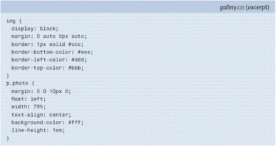
The definition of separate colors for each side gives the border on the image the desired inset look. We could have used the inset border-style that CSS already provides, but the colors for the light and dark borders differ between browsers. To create the look we want, we use a 1px, solid border, and specify #ccc as its color.
We use a slightly lighter shade (#ddd) for the right border, and darker shades for the top (#bbb) and left (#eee) borders. The result fools the eye into seeing a threedimensional edge. The addition of a 5px margin to the lower edge distances the outside border from the image. It’s aesthetically pleasing to have a larger space on the bottom than around the sides, and it works well with the Polaroid-style look we’re trying to create.
The link that contains the image has a solid border of 1px, which uses the same colors as before, although they’re reversed to create an “outset” look (we’ve switched the top and bottom colors, and the left and right colors). We also add a padding of 4px. This padding, plus the 1px border we’ve added to the image and the 1px border we’ve applied to the link provides us with the 6px value that we’ve applied for the h1’s and paragraph’s margins, and helps the edge of the text line up with the image, instead of the outside border.
To ensure that the outside border that’s applied to the link containing the image snaps snug to that image, we float the paragraph and link to the left, and apply a 75% width to the paragraph. This width is a workaround that was developed for Internet Explorer to avoid the outside border filling the entire width of the page in that browser; the page still renders as expected in other browsers.
Next we’ll add some hover styles: a subtle, light gray background, and one color for the border for all four sides. The description paragraph is then set to clear: left, to clear the float from the above-image paragraph. The result is shown in Figure 2.
 Figure 2. Page showing the bordered image
Producing a Quick and Simple Layout
Now, we want to define the spacing and width of the div that contains all the elements of our page. We’ll also increase the font size for items within this div, to create the effect shown in Figure 3. By adding the code at this point, instead of at the body level, we ensure that relative padding and margin sizes are affected only within this div:

Because the images we’re using are no wider than 500px, and we want to have room for the border around each image, we’ll use a width of 512px for #content. You can vary this value to reflect the maximum width of your images. I recommend setting a maximum of 500px to ensure that the entire image will fit within most browser viewports. Just make sure that the width of #content is equal to the total width of the image plus any left or right padding and border properties.
 Figure 3. Page showing the styled div
We’re almost done!

No comments:
Post a Comment